FairPrice . New journey led to 10x growth.
Background & my role
As the Senior Principal Product Designer at NTUC FairPrice, Singapore's leading supermarket, I was responsible for leading the digital transformation, focusing on enhancing the in-store shopping experience for our customers.
| Project: 3-4 months
| Role: UX Strategy, Journey Mapping, Usability Testing, Interaction & Visual Design

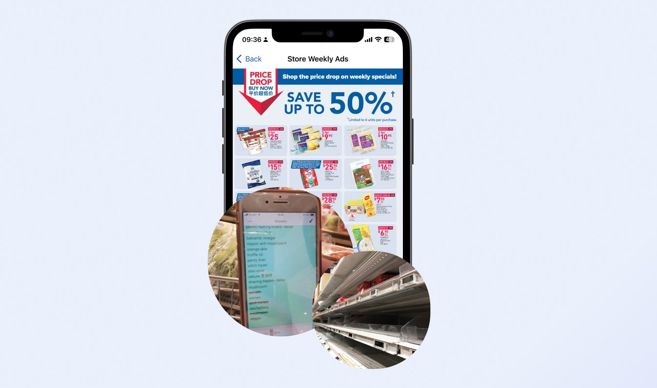
“Scan & Go, a mobile application under NTUC FairPrice, allows users to skip the queue in the supermarket as users can make payment directly in the app.”
Business problem
The business scope and objectives are changing: current Scan & Go product was not effective in encouraging customers to spend more.
One day the Head of O2O business shared a new business scope and objective to us:
To increase the Average Order Value (AOV) for all FairPrice in-store customers.
Our target extends from 20 stores with Scan & Go to all the FairPrice stores
After speaking with many of our key stakeholders, we all agreed that the current Scan & Go product was not effective in encouraging customers to spend more, so we decided to develop a new customer journey focused on the "Before Shopping" and "During Shopping" stages.

“Where Scan & Go did not significantly help uplift customer spending based on its product nature and positioning, we have a gut feeling that we might consider extending the product proposition. ”
About the User
The user base was widen with the goal of raising the Average Order Value.
Since we expanded our focus to include all in-store shoppers, not just those using Scan & Go, our user profiles have broadened accordingly.


Existing User Profile :
In-store users who only go to stores with Scan & Go
-Time-Savers
New User Profiles:
Users who go to ANY FairPrice stores
- Promos Driven Shopper
- Adventurous Shopper
- Budget Shopper
Customer problem
Identifying and addressing customer challenges: Sharing insights from journey mapping and previous research
I further proposed and shared my UX strategy with the Product Manager and Stakeholders, a few steps I took:
Looked at previous user research with my observations to understand our in-store shoppers’ shopping behavior.
Shared the journey mapping with stakeholders for customer problem discovery.

However, as was often the case, stakeholders had their preferences and viewpoints. Among these, some stakeholders advocated for the introduction of way-finding in the store. They believed it would not only support the staff on the floor but also enhance the attractiveness of the technology itself.
Qualitative research was not enough
Within my UX strategy, I had planned a customer survey to identify the most pressing issues for our users. This would offer stakeholders a clearer perspective on the primary customer challenges that needed addressing.
The survey findings indicated that users:
Flyer Recall Trouble: 40% of users found it troublesome to remember purchases from flyers.
Out-of-Stock Frustration: 38% of users faced unexpected stock shortages, forcing them to change recipes at the last moment.
In-Store Navigation Ease: Only a small number of users (5%) struggled with locating items in-store.
This information was crucial in guiding our focus on enhancing the pre-shopping preparation rather than just improving way-finding in the store.

Regarding on Flyer Recall Trouble, it stood out as a critical problem to tackle to elevate customer spend, e.g. by making it easier for customers to spot and remember deals, there was a greater chance they'd add more to their shopping carts.
Goals
️️To develop an ideal customer journey:
1. making it simpler to discover and remember what to buy
2. allowing customers to plan better on what to buy before the trip
Think big:
Explore solutions for other pain points to ensure future scalability.
Start small:
Working backward to develop a MVP.
I facilitated the team through in-depth discussions to collaboratively design an ideal customer journey based on identified customer problems. Throughout this process, I also actively communicated with stakeholders, gathered their feedback as well as challenge their hypothesis, and participated in discussions to discover the optimal path for customer experience.
Key hypothesis

Solution
With an in-app shopping list, I’m able to monitor and get latest promos and availability update.
Expected behaviour
Customers would be reminded and motivated to buy more because of ‘saving more’ and ‘FOMO’.
Journey
Improve in-store product discovery: Replace flyer-like visuals with clear presentations and utilize an in-app shopping list for easy bookmarking, ensuring users are updated with deals and items availability.

The in-app shopping list serves not only for bookmarking deals and tracking item availability, but is also designed for future by providing aisle information to guide users directly to products when they are in the store.
Concept / Usability Testing
I built the prototype around a set of hypotheses. While a researcher conducted the usability testing, I observed and iterated the design during the testing with 12 participants.
The journey shaped users’ mental models, which in turn guided the design of our interface.
While I specifically created an ‘Add an item’ call-to-action button on the shopping list screen, it did not go well.
While customers were asked to add items to their shopping list, most of them went back to the home screen and started searching
Customers held a firm belief in starting their item searches from the home screen, reflecting a specific expectation of how they navigate and discover items.
Hence the ‘Add an item’ button became useless to most of them

Refine the MVP through discussions with the Product Manager and customer insights.
We discussed and presented the refined Minimum Viable Product (MVP) to the product manager and stakeholders. This version was based on the insights gained from the concept and usability testing, focusing on the most achievable and impactful features.

Final Design


Result
The results of our customer journey launch were highly successful, with a 1000% increase in digital in-store traffic, a 10% engagement rate for the new digital shopping list, and an 8% increase in Average Order Value. We shared our achievements with both senior management and the wider company in two presentations.
~1000%
increased traffic for digital in-store traffic (page impression)
~10%
engagement / traffic for the new shopping list
~9%
Increased in AOV (For those using the in-app shopping list)
Other impacts
Users adapted to a new in-store shopping behaviour
“After checking the app and seeing a $6 discount on frozen salmon, I immediately visited the store and ended up purchasing 6 of them.” - customer
The new journey set a foundation for a scalable product in future
3rd party advertisement
Discover in-store voucher
In-store gamification
Click & Collect
Summary & learning
Customers play a crucial role in guiding us through significant ambiguity, from identifying the problem to crafting solutions.
Customers were the north stars, again: We learned that customers' expectations and perceptions of value can drive everything and can often differ from our hypotheses. New expectations also arose during the project, such as a desire for a click-and-collect service.
Navigate uncertainty with an open mind: To handle huge ambiguity, we need to ask questions to stakeholders from customers’ point of view and be open-minded about hypotheses, then validate the needs of customers.
New customer behaviors opened up fresh opportunities for advertising exposure.
The 10x increase in digital in-store traffic allowed businesses to view it as an additional channel for third-party advertising.
What could have done better?
Setting a better UX measurement earlier could resulted in a more joyful celebration.
Sustaining a long-term UX strategy requires ongoing measurement: The survey should not be a one-off research but more a regular one, then we could regularly measure the satisfaction and how significantly we solved the problems
Defining UX metrics early and separately from product metrics is essential: Had we established key UX metrics like customer satisfaction at the project's start, we would have had even more reason to celebrate its success.